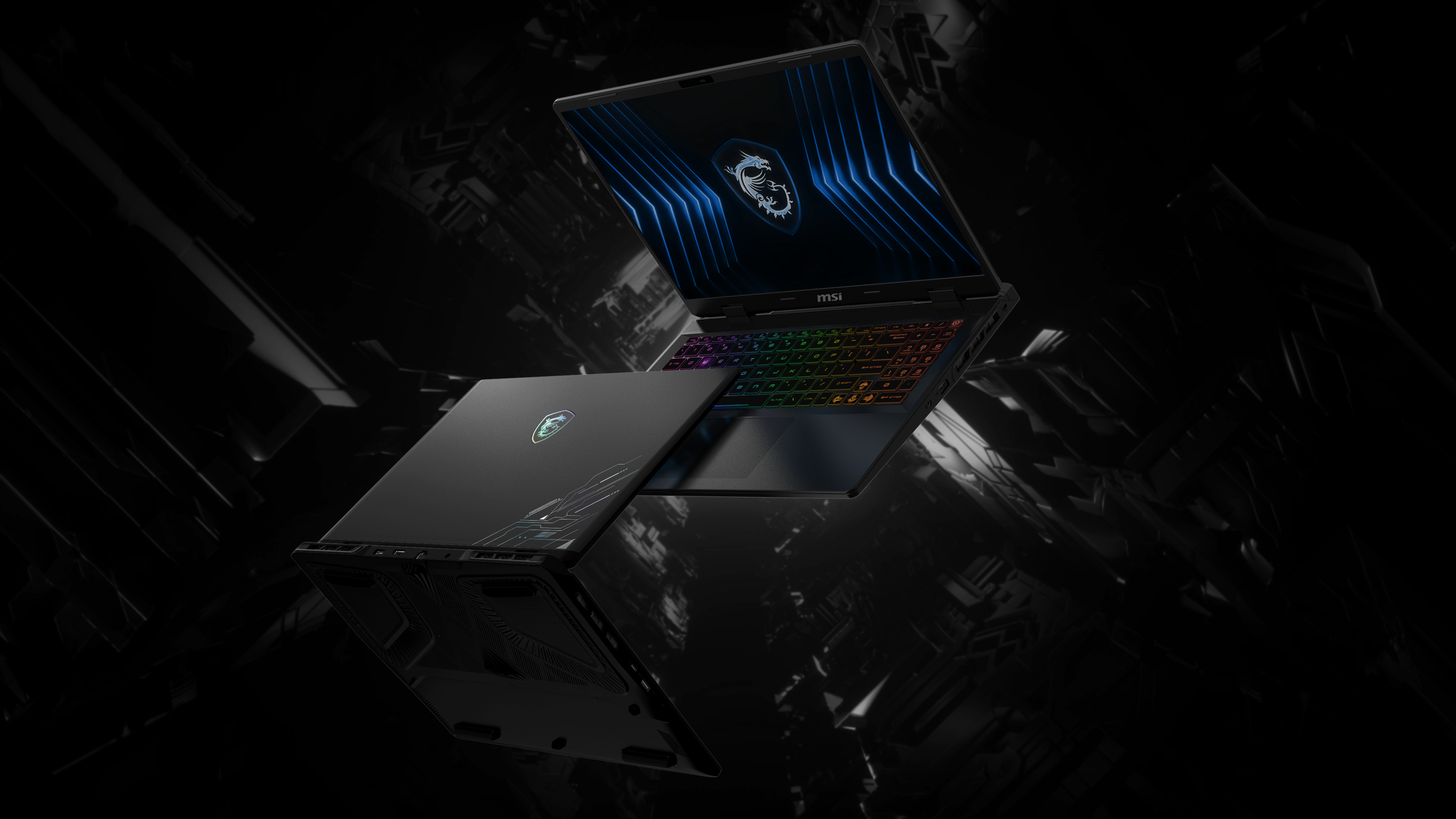
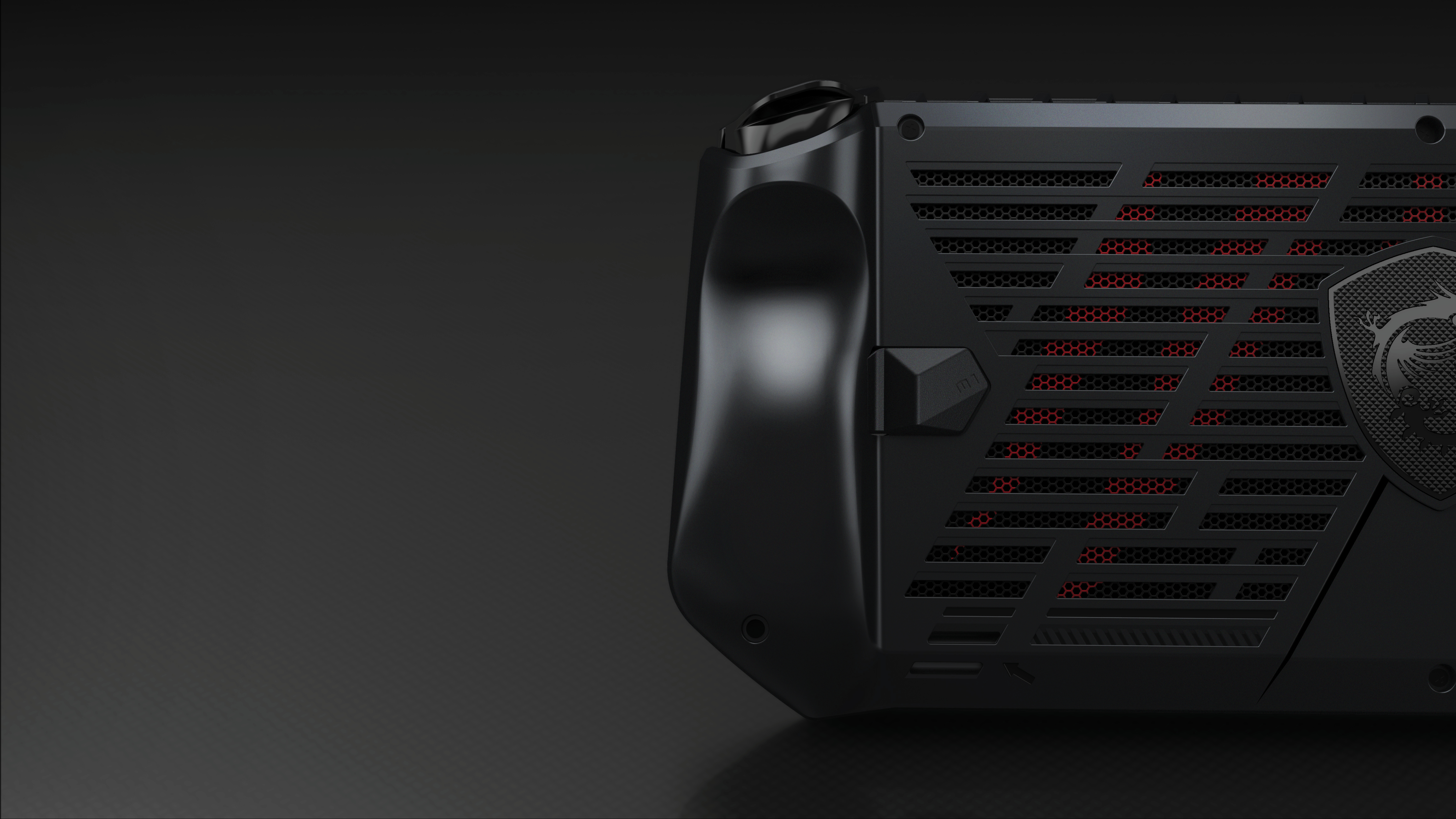
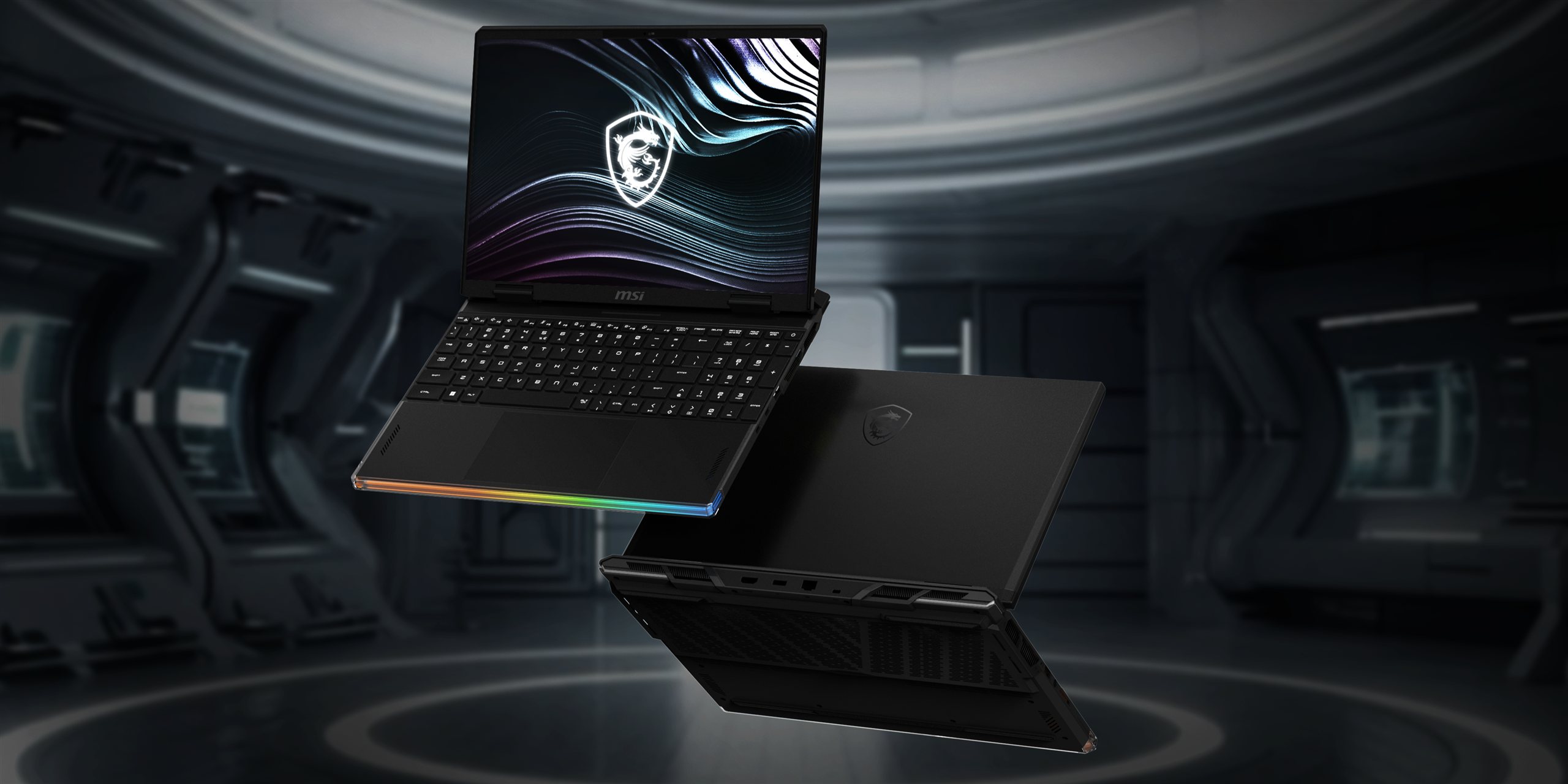
From artwork to mass production. Separated into printable layers, tuned across three print rounds, and held to one appearance standard across two chassis sizes.從圖檔到量產。拆成可印刷的分層、經三輪打樣調到定位,並在兩個尺寸的機殼上守住同一份外觀標準。
Summary重點摘要
I ran the CMF back end for Pulse 16 and 17. I took a selected pattern concept through colour separation, film printing and mass-production colour control, while carrying the same job on Crosshair in parallel.我負責 Pulse 16 與 17 的 CMF 後端。 把中選的圖騰概念一路帶過分色、印刷與量產色彩管控,同一時間也在跑 Crosshair 的同樣工作。
2
Chassis Sizes機殼尺寸
15P and 17T carried in parallel to the same standard15P 與 17T 並行推進,守住同一標準
3
Print Sample Rounds印刷打樣輪次
Pearl ratio and hue tuned to sign-off in six weeks六週內把珠光比例與色相調到簽樣
20%
Final Pearl Ratio最終珠光比例
Raised from 15%, chosen over 25%從 15% 提高,與 25% 比較後定案
8 mo
Kick-Off to Production開案到量產
July 2023 kick-off, mass production March 20242023 年 7 月開案,2024 年 3 月量產
Recognition獲獎肯定
Red Dot Design Award 2024
Pulse 16 / 17 was recognised at Red Dot 2024. The award cites the whole machine: the cooling architecture, the chassis and the surface. The colour-shift IMR finish is the part I took from artwork to production.
Four separate projects on my desk at the same time: Pulse 16 and 17 alongside Crosshair 16 and 17, each on its own tools, schedule and vendor set. I took the day-to-day calls and escalated only what moved cost or schedule: driving the vendors, chasing samples through every build, and gating what reached production.
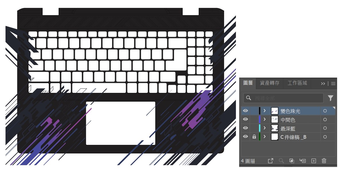
Breaking a flat graphic into the printable layers an IMR film actually needs: pearl, mid tone, deepest blue and part linework, each one a printing plate.把一張平面圖檔拆成 IMR 膜真正需要的印刷分層:珠光、中間色與最深藍各自一塊版,底下再墊一層件體線稿作為套位基準。
02
Pearl Development珠光開發
Three rounds of print samples with the printing house, moving the colour-shift pearl from 15% to 20% and correcting hue until the effect held.與印刷廠來回三輪打樣,把變色珠光從 15% 推到 20%,並修正色相直到效果站得住。
03
Colour Control色彩管控
A standard colour board plus upper and lower limits, signed off with the film supplier. That is the reference every production batch is measured against.標準色板,連同上下限度色板,與膜材供應商完成簽樣。 那是每一批量產都要對照的依據。
04
Two Sizes, One Finish兩個尺寸,同一表面
15P and 17T run on separate tools and separate film widths, yet have to look like the same product side by side.15P 與 17T 走不同模具、不同膜寬,但放在一起必須看起來是同一款產品。
The Brief設計命題
Electromagnetic Pulse電磁 脈衝
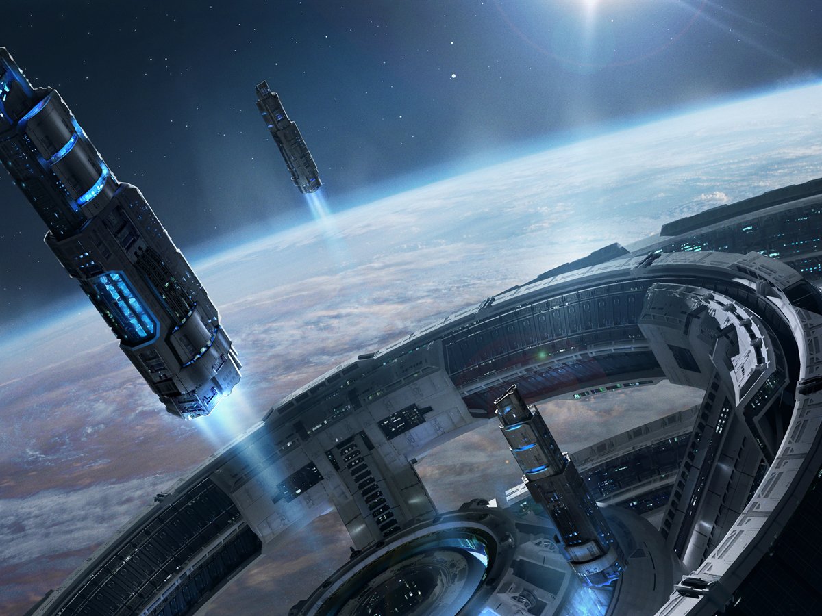
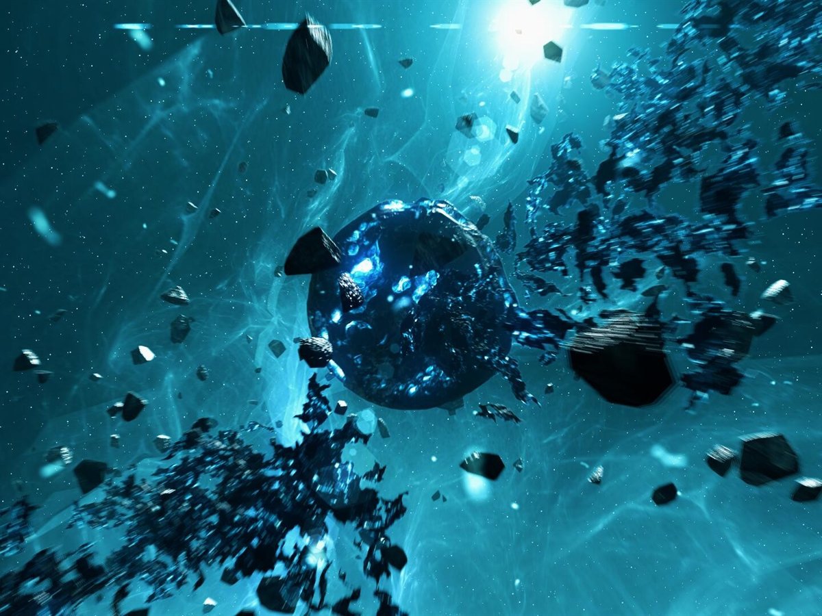
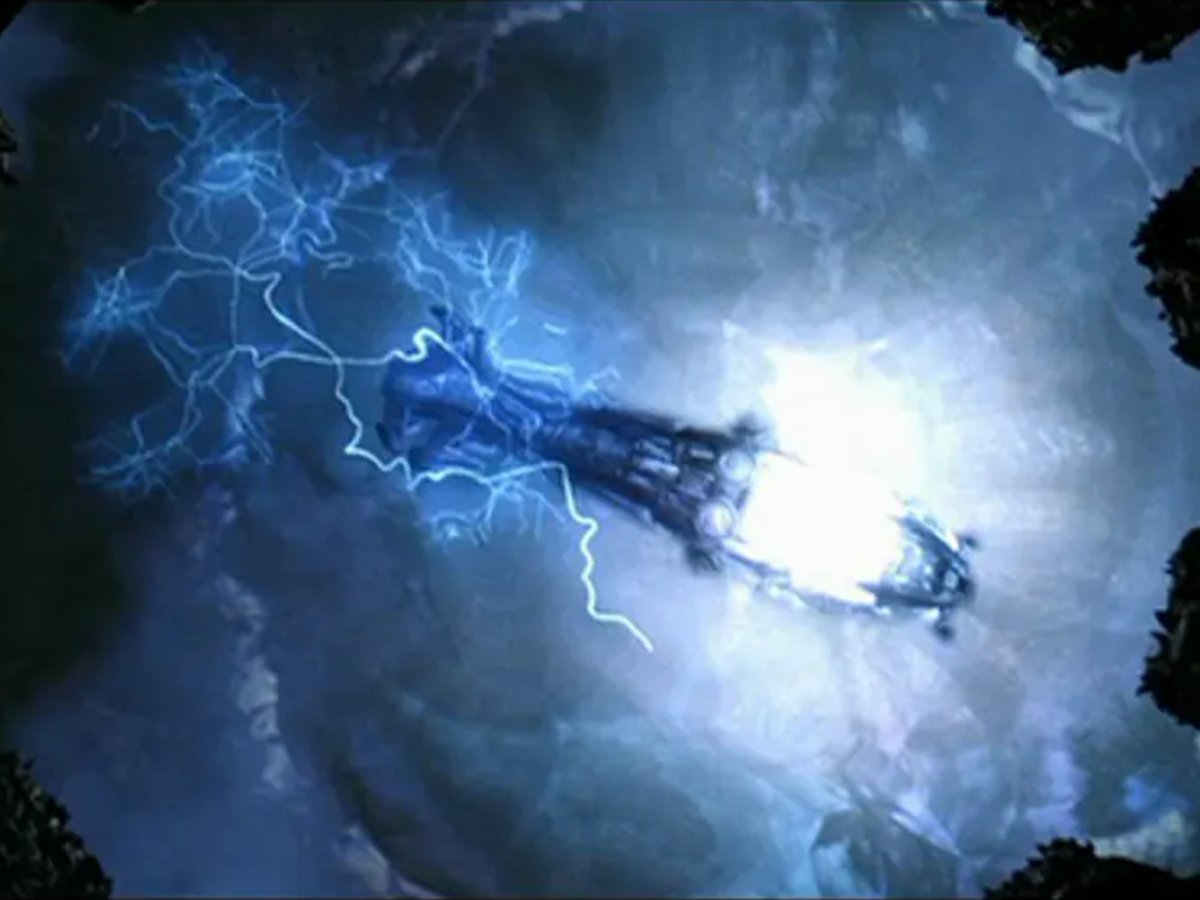
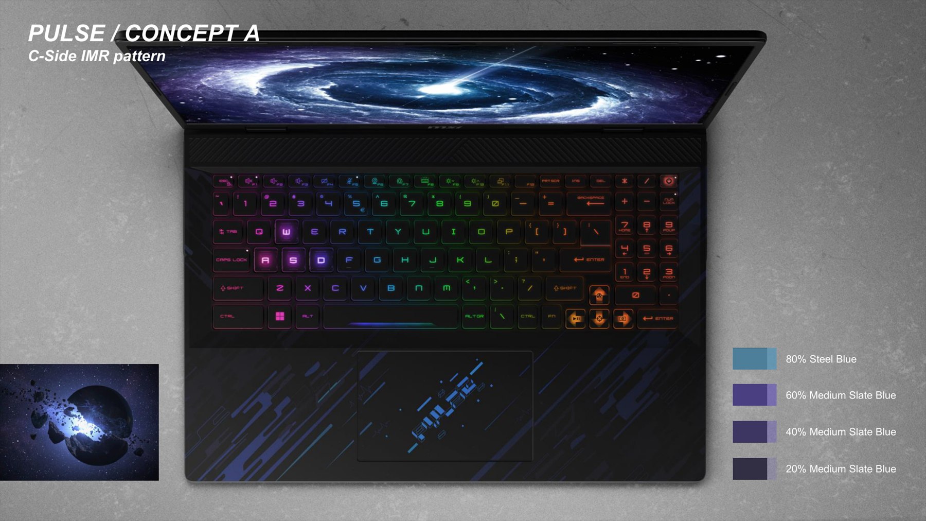
The concept is outer-space energy, an electromagnetic pulse, answering the spacecraft language of the whole machine. Printed through IMR, the contrast of line against tone gives the surface speed and sharpness, and lifts how the whole thing reads.以外太空的能量為主軸,也就是 EMP 電磁脈衝,呼應整機的太空載具風格。 透過 IMR 印刷工藝,以圖面的線條對比與色調呈現速度感與銳利感,提高整體外觀質感與吸引力。
Spaceship太空船
Cosmic Energy宇宙能量
EMP電磁脈衝
CMF ScopeCMF 範圍
Two surfaces, ours to propose兩個面,由 CMF 提案
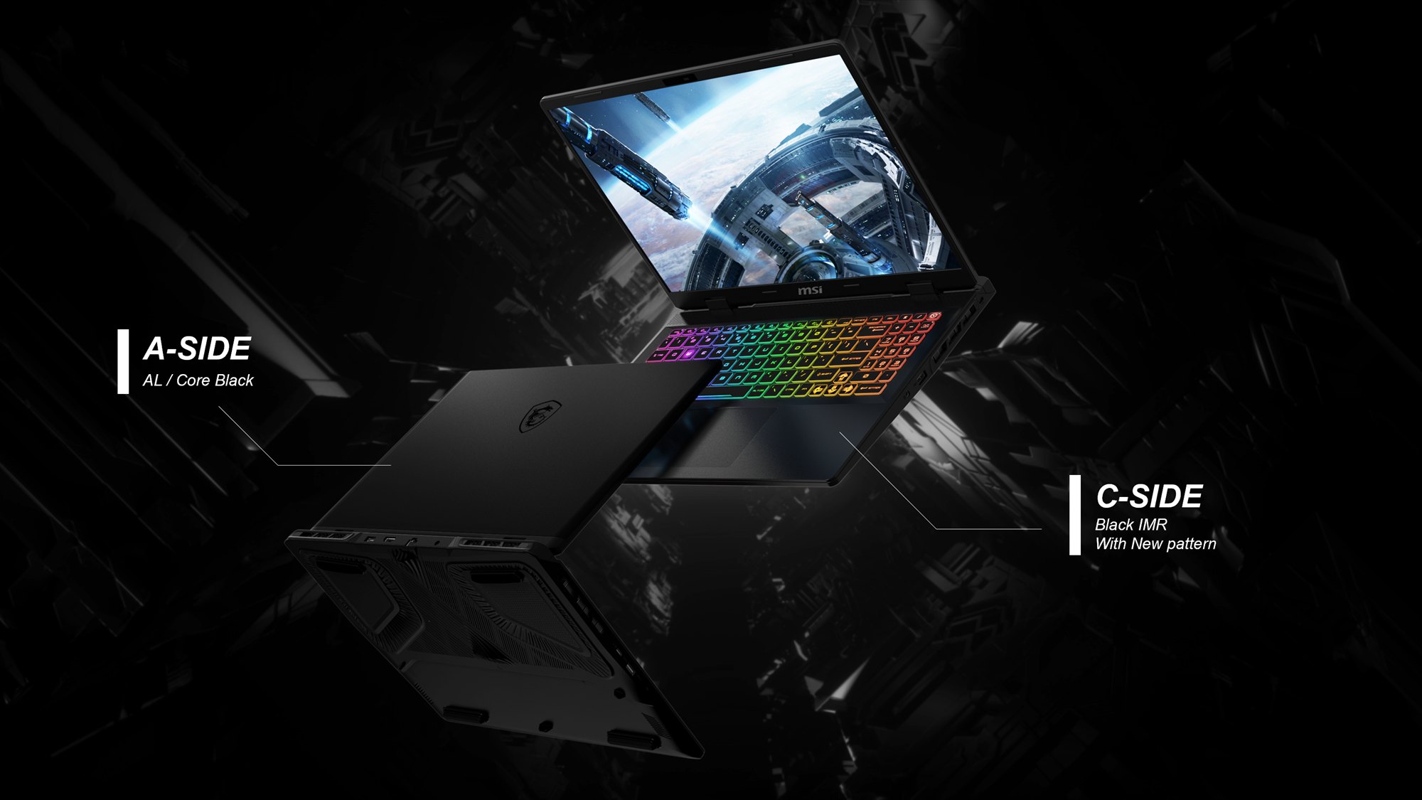
The CMF team proposed two surfaces on this machine. A-side: anodised aluminium in core black, the closed-lid first impression, carried entirely by tone and finish with no graphic at all. C-side: black IMR carrying the new pattern, the surface your hands sit on for hours. B and D stayed on textured plastic.這台機器上由 CMF 團隊提案的有兩個面。 A 件:鋁件陽極、核心黑,闔蓋時的第一印象,完全靠色調與質感撐起,沒有任何圖案。 C 件:黑色 IMR 承載新圖騰,你的手會放上去好幾個小時的那一面。 B 與 D 件維持塑膠咬花。
Colour Ladder色階
Four steps of blue四階藍
The pattern is built from one hue at four densities, 80% Steel Blue down to 20% Medium Slate Blue. Narrow on purpose: the fewer inks on the film, the fewer things can drift between batches.圖騰由同一色相的四個濃度組成,從 80% Steel Blue 到 20% Medium Slate Blue。 刻意收窄:膜上的墨色愈少,批次之間會跑偏的地方就愈少。
Colour Separation圖檔分色
Nine layers available. We used four.最多能疊九層, 我們用了四層。
The film supplier's line runs 14 printing plates. Strip out the top and bottom layers the process needs and nine stacks are left to spend. Every plate on the film adds cost, priced against the process it sits in. So the separation was a budget, not a wish list. We spent four: three printed colours and one colour-shift pearl.合作廠商的單一產線有 14 道版銅。 扣掉製程必須的頂層與底層,最多可以疊九道不同的層。 膜上每多一道版就多一分成本,且價格會隨工法與版銅數量變動。 所以分色是在編預算,不是開清單。 我們用了四道:三道印刷色,加一道變色珠光。
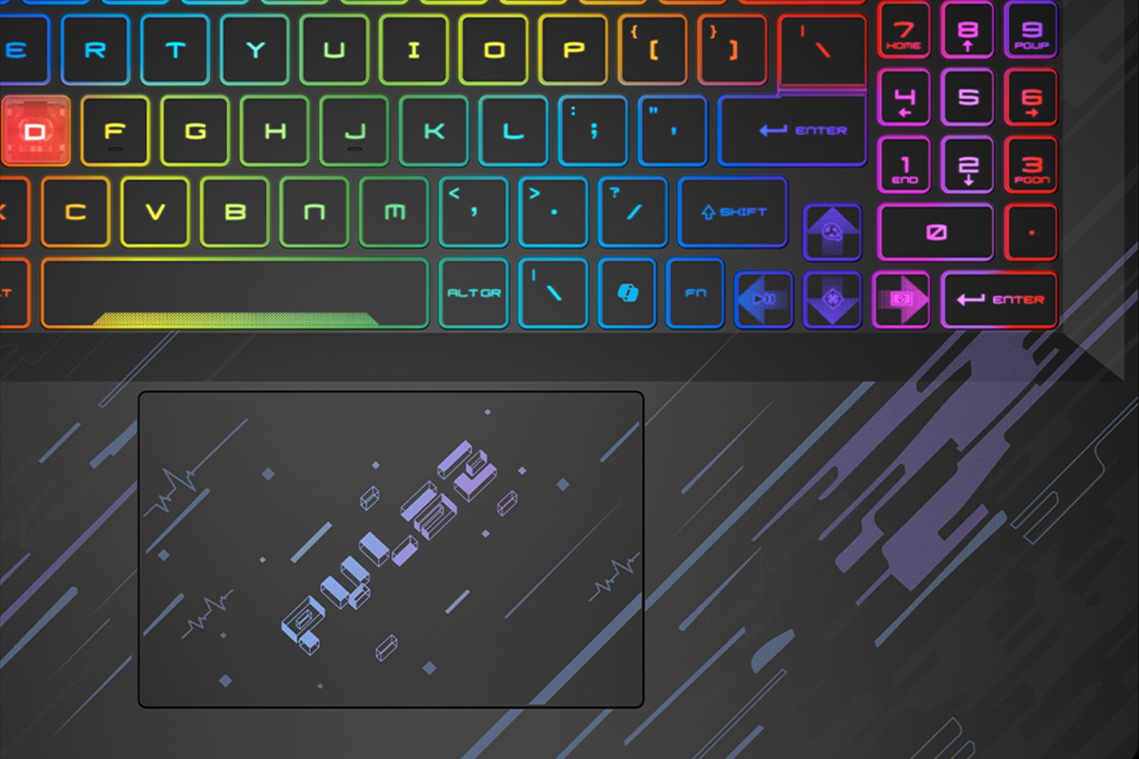
Final artwork file. Colour-shift pearl, mid tone and deepest blue, over the part linework used for register最終圖檔。 變色珠光、中間色、最深藍,疊在作為套位基準的件體線稿上
+
Layer order is not cosmetic圖層順序不是美觀問題
Which layer prints first decides what sits under what. Get the order wrong and the pearl ends up buried beneath the blue. The pattern is still there, and the effect is gone. Plate sequence is checked on every film that comes in.哪一層先印,決定了誰壓在誰下面。 順序錯了,珠光就被壓在藍色底下。 圖案還在,效果沒了。 所以每一批進來的膜,版序都要查。
Tuning the Pearl調出那道珠光
15% was not enough15% 的珠光 還不夠
Three finishes went to the printing house to be sampled: a black-to-blue gradient, a colour-shift pearl, and a flat solid. The pearl was the only one that gave the pattern a reason to exist. But the first samples came back at 15% pearl, and the shift barely registered under office light.送去印刷廠打樣的有三種表面:黑藍漸層、變色珠光、實色。 只有珠光讓這個圖騰有存在的理由。 但第一批樣品的珠光只有 15%,在辦公室燈光下幾乎看不出變化。
01
Round two: 20% against 25%第二輪:20% 對 25%
I asked for both. 25% was undeniably iridescent, but it turned the blue milky and the four-step ladder collapsed into one hazy tone. 20% kept the shift and kept the blue. That became the spec.兩個我都要了。 25% 的幻彩效果確實更強,但也把藍色打濁了,四階色梯塌成一片霧。 20% 保住了變色,也保住了藍。 這就成了規格。
02
Round three: hue, then sign-off第三輪:修色相,然後簽樣
Pearl held at 20%, hue pulled back towards the concept blue. Samples confirmed on 6 November and released to MVT material preparation. Six weeks from first request to signed effect.珠光維持 20%,色相往概念藍拉回。 11 月 6 日確認效果,放行 MVT 備料。 從提出需求到效果簽樣,前後六週。
The signed-off effect, on the production surface簽樣後的效果,在量產表面上
Colour That Moves會動的顏色
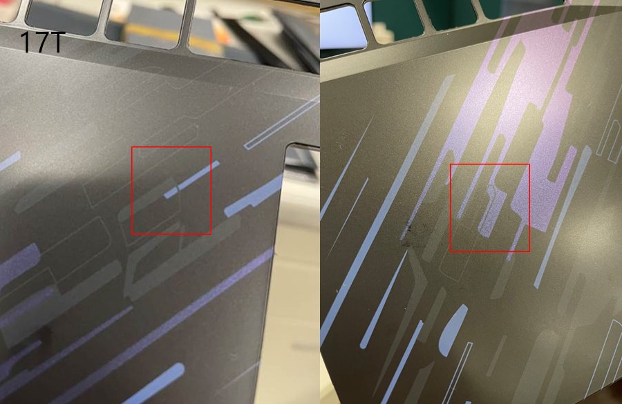
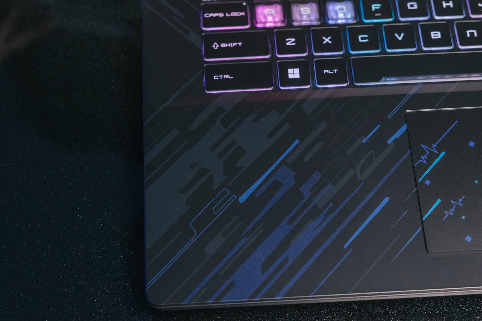
Tilt the part and the pattern arrives. Straight on it is almost gone, a dark graphic on a dark surface. At an angle the pearl catches and the whole zone lifts into lilac. That gap between the two readings is the entire design.把件體傾斜,圖騰才出現。 正視幾乎看不見,暗色圖案壓在暗色表面上。 斜看時珠光被打亮,整個區域浮成淡紫。 兩種讀法之間的落差,就是這個設計的全部。
17T line sample. The same zone, two angles, checked on the shop floor17T 產線樣品。 同一區域、兩個角度,在現場檢查
In Production量產成品
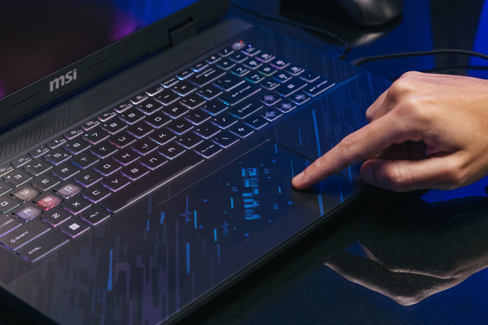
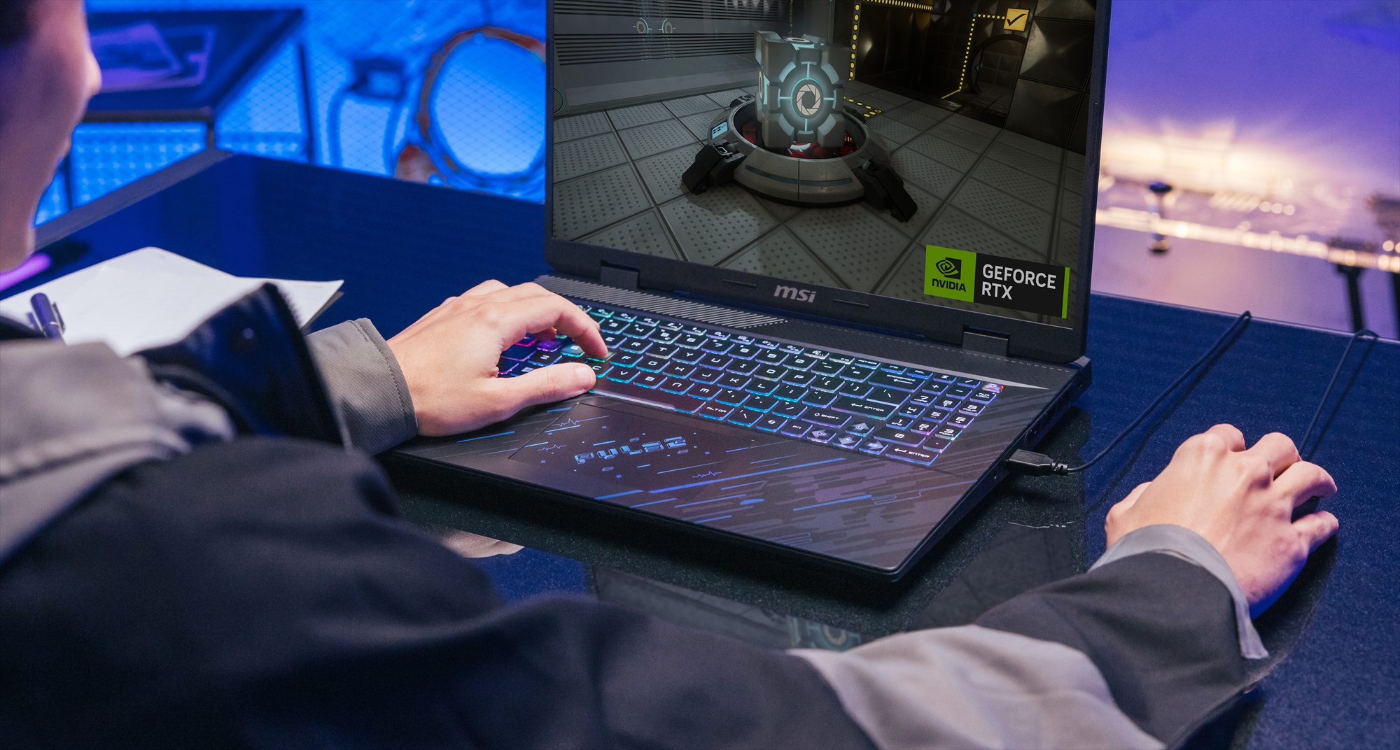
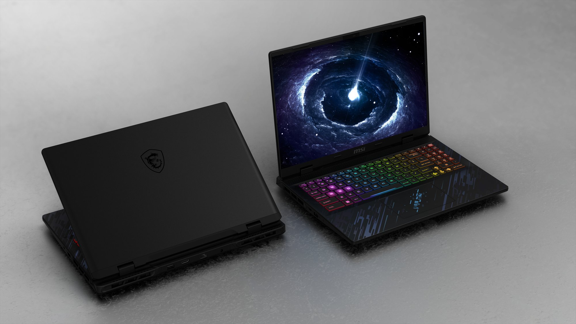
Pulse 16 / 17. A-side in anodised aluminium, C-side carrying the printed patternPulse 16 / 17。 A 件鋁件陽極,C 件承載印刷圖騰
Trackpad. The pattern carries across it, so the film has to register within tolerance every time. Over 30 parts were sampled at sign-off and measured against the film on a 3D instrument.觸控板。 圖騰橫過觸控板與其呼應,膜的套位每次都得落在公差內。 簽樣時特別打了 30 多件樣品,以 3D 量測儀搭配膜片確認公差。
+
Why paint-free matters here無噴漆在這裡的意義
IMR forms the decoration during moulding, so the part leaves the tool finished. No spray line, no second transport, no solvent. And because there is no coating on top, the recycled content underneath stays recyclable at end of life. The PCR plastic in the C-side is what earns credit under EPEAT, the registry that scores post-consumer recycled content in laptops.IMR 在成型的同時就完成了裝飾,件體離模即是成品。 沒有噴塗線、沒有二次運輸、沒有溶劑。 而且因為表面沒有塗層,底下的回收料在產品壽命結束後仍然可回收。 C 件採用的 PCR 回收塑料,正是 EPEAT(評核筆電消費後回收料含量的登錄制度)給分的項目。
Timeline歷程
Kick-Off to Mass Production從開案到 量產
July – September 20232023 年 7–9 月
Kick-off to first tool開案到首次試模
Project opened 24 July. Tooling started 3 September, first shots 6 September. The pattern concept was selected and handed over for production preparation.7 月 24 日開案,9 月 3 日開模,9 月 6 日 T1 試模。 圖騰概念在此期間定案,並交付進入量產準備。
September – November 20232023 年 9–11 月
Separation, sampling and sign-off分色、打樣與簽樣
Artwork separated and plates opened on the pearl build. Three print rounds took the pearl from 15% to 20% with hue correction; effect confirmed 6 November. Standard and limit colour boards approved 17 November. EVT ran 10 November.完成分色,以珠光方案開立版銅。 三輪印刷打樣把珠光從 15% 推到 20% 並修正色相,11 月 6 日確認效果。 11 月 17 日標準色板與上下限度色板確認。 11 月 10 日進 EVT。
November – December 20232023 年 11–12 月
Plate sequence caught and corrected攔下版序錯誤並修正
Hand-pulled MVT film rejected on 27 November for reversed plate order on both sizes. 200 m reprinted per size; corrected standard boards signed 5 December. MVT held its date on 25 December.11 月 27 日因兩個尺寸版序顛倒退回 MVT 手工膜,各重印 200 米,12 月 5 日完成修正標準板簽樣。 MVT 仍如期於 12 月 25 日進行。
February – March 20242024 年 2–3 月
ATS and mass productionATS 與量產
ATS 21 February, mass production 16 March. Both sizes shipped on the same signed appearance standard, eight months from kick-off.2 月 21 日 ATS,3 月 16 日量產。 兩個尺寸依同一份簽樣的外觀標準出貨,距開案八個月。
Want to know how the colour was held across two sizes?想知道兩個尺寸的顏色是怎麼守住的嗎?